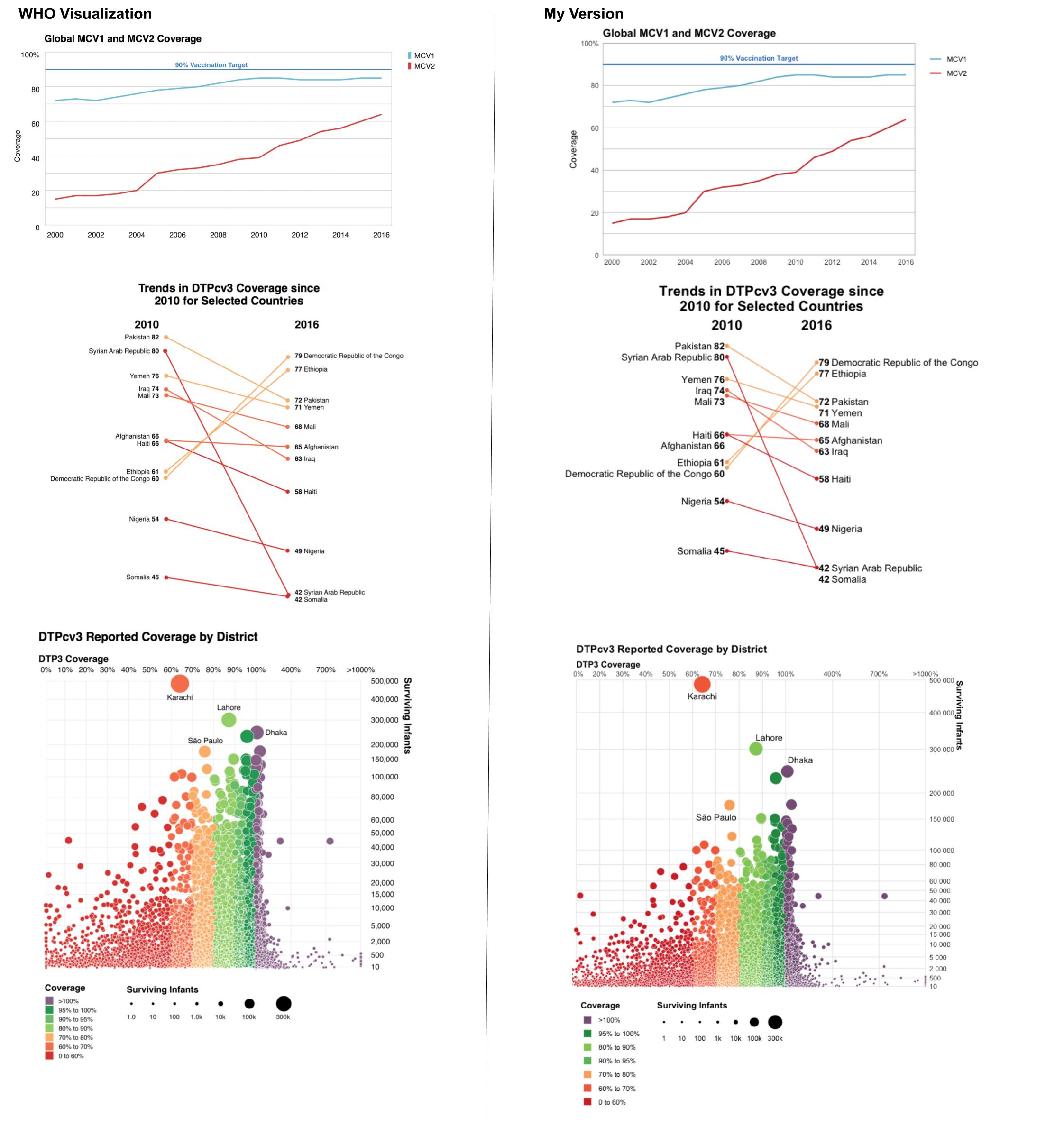
Replicating WHO Visualizations of Global Immunization Coverage
Each year, the World Health Organization releases a report with estimates of global immunization coverage. The report lots of visualizations of their data, and they release the data used for each visualization publicly. About a year ago, fresh out of Data Challenge Lab, the class offered by the Stanford Data Lab which I then TA’d a year later, I decided to practice some of my new vis skills by trying to replicate some of the visualizations in the 2016 report.
I replicated three visualizations. Below are the comparisons of WHO’s vis against mine. All the code to create my plots is at the bottom of this post! I’m not fully convinced that the WHO visualizations are the most effective, for example two of them use redundant color, but for the challenge I tried to replicate them as faithfully as possible.
Below is the code for the three plots my way!
First, I load the data and libraries and define some functions and constants for all three plots.
# Libraries
library(tidyverse)

# Files
data_dir <- "~/Data/who-immunizations/"
file_global_mcv <- str_c(data_dir, "global_regional_coverage.csv")
file_weunic <- str_c(data_dir, "wuenic_master_07_06_2017.csv")
file_subnational <- str_c(data_dir, "subnational_06_29_2017.csv")

# Constants
national_dtp3_countries <- c(
  "Pakistan",
  "Syrian Arab Republic",
  "Yemen",
  "Iraq",
  "Mali",
  "Afghanistan",
  "Haiti",
  "Ethiopia",
  "Democratic Republic of the Congo",
  "Nigeria",
  "Somalia"
)

subnat_coverage_order <- c(
  "0 to 60%",
  "60% to 70%",
  "70% to 80%",
  "90% to 95%",
  "80% to 90%",
  "95% to 100%",
  ">100%"
)

subnat_x_breaks <- c(seq(0, 100, by = 10), 400, 700, 1000)
subnat_y_breaks <- c(
  10, 500, 2000, 5000, 10000, 15000,
  seq(20000, 60000, by = 10000),
  80000, 100000, 150000,
  seq(200000, 500000, by = 100000)
)
subnat_size_breaks <- c(1, 10, 100, 1000, 10000, 100000, 300000)

subnational_dtp3_labels <- c("Dhaka", "Lahore", "Karachi", "São Paulo")

# I picked the colors from the original plots using an online color picker
color_mcv1 <- "#69bcd1"
color_mcv2 <- "#d13f3e"
color_mcv_refline <- "#367cc1"
colors_dtp3_subnational <- c(
  "0 to 60%" = "#d5322f",
  "60% to 70%" = "#f36d4a",
  "70% to 80%" = "#fbad68",
  "80% to 90%" = "#92cc64",
  "90% to 95%" = "#6abc68",
  "95% to 100%" = "#249752",
  ">100%" = "#876086"
)

# Helper functions
global_mcv_y_labels <- function(vals) {
  # Add the percent sign only to the very top (100%) label
  if_else(vals == 100, str_c(vals, "%"), str_c(vals))
}

subnat_x_labels <- function(vals) {
  # Add the percent sign to all but make the last element >X%
  vals <- scales::percent(vals, accuracy = 1, scale = 1)
  vals[length(vals)] <- str_c(">", vals[length(vals)])
  vals
}

subnat_size_labels <- function(vals) {
  if_else(vals > 100, str_c(vals / 1000, "k"), str_c(vals))
}

x_trans_trans <- function(x) {
  # Custom axis transformation for subnational dtp3 plot
  scales::trans_new(
    "x_trans",
    function(x) if_else(x <= 100, x, 93.5 + (x/15)),
    function(x) if_else(x <= 100, x, (x - 93.5) * 15)
  )
}

# ==============================================================================

global_mcv <- read_csv(file_global_mcv)
weunic <- read_csv(file_weunic)
subnational <- read_csv(file_subnational)
Global MCV Coverage
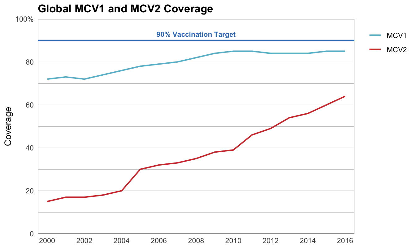
This visualization shows the percentage of children worldwide receiving the MCV1 and MCV2 vaccines between 2000 and 2016. Vaccination coverage has been steadily increasing for both vaccines, though neither has reached the 90% target. MCV2 coverage is lower overall than MCV1 coverage, but is increasing at a faster rate.
global_mcv %>%
  rename_all(str_to_lower) %>%
  filter(
    group == "Global",
    vaccine %in% c("mcv1", "mcv2"),
    year >= 2000
  ) %>%
  ggplot() +
  geom_line(aes(year, coverage, color = vaccine), size = 0.8) +
  geom_hline(yintercept = 90, color = color_mcv_refline, size = 0.8) +
  annotate(
    geom = "text",
    x = 2008,
    y = 93,
    hjust = 0.5,
    label = "90% Vaccination Target",
    color = color_mcv_refline,
    size = 3,
    fontface = "bold"
  ) +
  scale_x_continuous(
    breaks = seq(2000, 2016, by = 2)
  ) +
  scale_y_continuous(
    breaks = seq(0, 100, by = 20),
    limits = c(0, 100),
    labels = global_mcv_y_labels
  ) +
  scale_color_manual(
    values = c("mcv1" = color_mcv1, "mcv2" = color_mcv2),
    labels = str_to_upper
  ) +
  theme_minimal() +
  theme(
    plot.title = element_text(face = "bold"),
    legend.justification = c("right", "top"),
    panel.grid.major.x = element_blank(),
    panel.grid.minor.x = element_blank(),
    panel.background = element_rect(color = "grey60"),
    panel.grid.minor.y = element_line(color = "grey60", size = 0.2),
    panel.grid.major.y = element_line(color = "grey60", size = 0.2)
  ) +
  coord_cartesian(
    xlim = c(1999.5, 2016.5),
    ylim = c(0, 100),
    expand = FALSE,
  ) +
  labs(
    x = NULL,
    y = "Coverage",
    color = NULL,
    title = "Global MCV1 and MCV2 Coverage"
  )
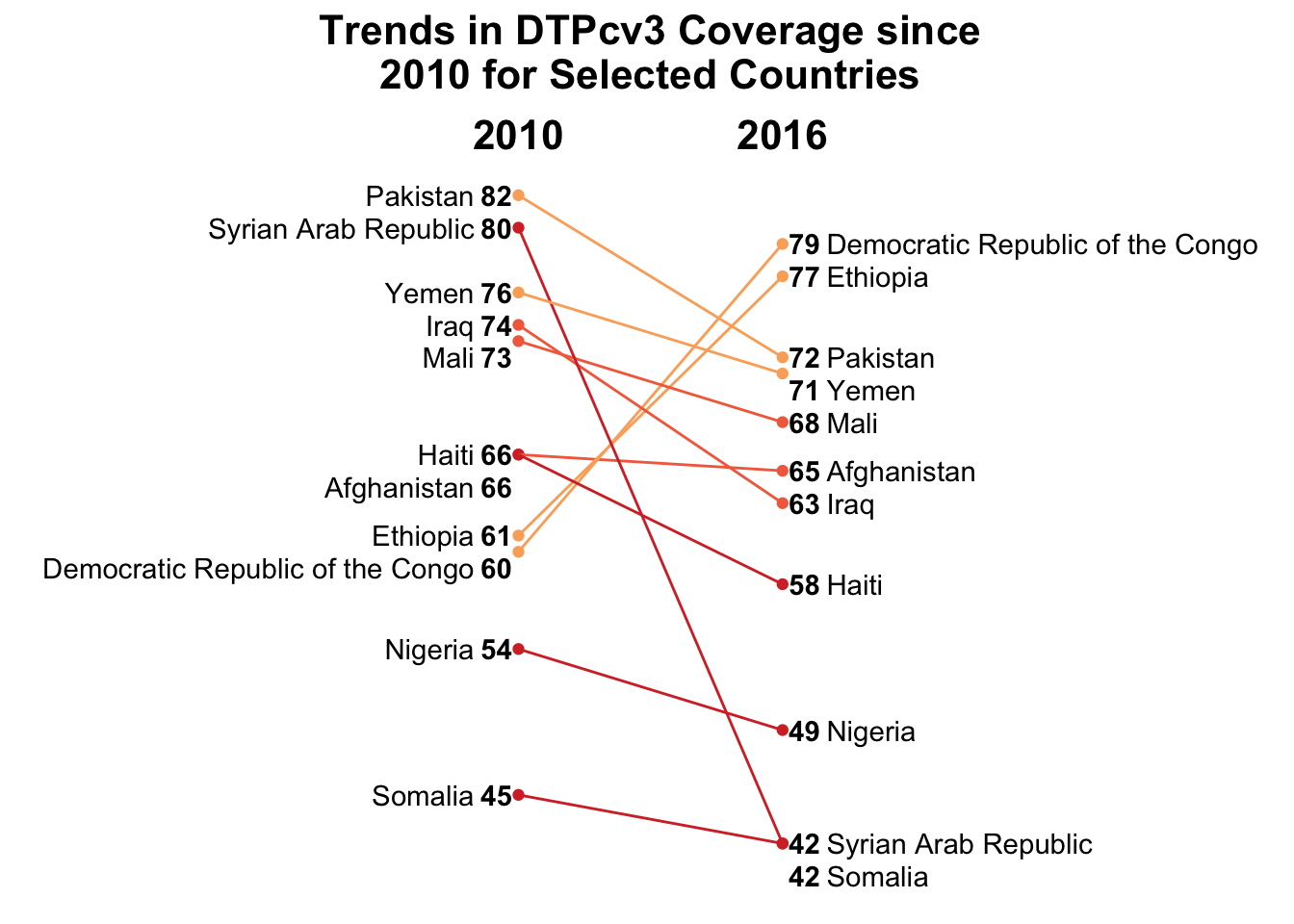
National DTP3 Coverage
This visualization shows the change between 2010 and 2016 in DTP3 coverage in select countries. Like in the next visualization (subnational DTP3 coverage), color is encoding coverage in 2016, which is a redundant encoding. I did find that the graph is much more pleasing to the eye with the encoding, but is much simpler to understand without it, in my opinion.
There was a little bit of data manipulation to be done for this plot. The first step is filtering to the vaccine, countries and years we want. Then there is a mutate to create some helpful plotting variables. I created the tibble weunic_country_colors to keep track of which country should be which color.
weunic <-
  weunic %>%
  rename_all(str_to_lower) %>%
  filter(
    year %in% c(2010, 2016),
    vaccine == "dtp3",
    country %in% national_dtp3_countries
  ) %>%
  select(wuenic, year, country) %>%
  arrange(year, wuenic) %>%
  mutate(
    diff_to_next = lead(wuenic) - wuenic,
    ynudge = case_when(
      diff_to_next == 1 ~ -1,
      diff_to_next == 0 ~ -2,
      TRUE ~ 0
    ),
    ypos = wuenic + ynudge
  )

weunic_country_colors <-
  weunic %>%
  filter(year == 2016) %>%
  mutate(
    color = case_when(
      wuenic < 60 ~ "red",
      wuenic < 70 ~ "orange",
      TRUE ~ "yellow"
    )
  ) %>%
  select(country, color)

weunic <-
  weunic %>%
  left_join(weunic_country_colors, by = "country")
Now the data is ready to plot! The code is long mostly because there are four labels for each country, and each needs to be a different type face and justification! The rest of the plot is quite basic.
weunic %>%
  ggplot() +
  geom_point(aes(year, wuenic, color = color)) +
  geom_segment(
    aes(
      y = `2010`,
      yend = `2016`,
      color = color
    ),
    x = 2010,
    xend = 2016,
    data = select(weunic, country, year, wuenic) %>%
      spread(year, wuenic) %>%
      left_join(weunic_country_colors, by = "country")
  ) +
  geom_text( # Label points with the numeric value
    aes(
      y = ypos,
      label = wuenic
    ),
    x = 2009.5,
    fontface = "bold",
    data = filter(weunic, year == 2010)
  ) +
  geom_text( # Label points with country name
    aes(
      y = ypos,
      label = country
    ),
    x = 2009,
    hjust = 1,
    data = filter(weunic, year == 2010)
  ) +
  geom_text(
    aes(
      y = ypos,
      label = wuenic
    ),
    x = 2016.5,
    data = filter(weunic, year == 2016),
    fontface = "bold"
  ) +
  geom_text(
    aes(
      y = ypos,
      label = country
    ),
    x = 2017,
    hjust = 0,
    data = filter(weunic, year == 2016)
  ) +
  scale_x_continuous(
    breaks = c(2010, 2016),
    limits = c(2000, 2026),
    position = "top"
  ) +
  scale_color_manual(
    values = c(
      "red" = "#d5322f",
      "orange" = "#f36d4a",
      "yellow" = "#fbad68"
    )
  ) +
  theme_minimal() +
  theme(
    panel.grid = element_blank(),
    axis.text.y = element_blank(),
    axis.text.x = element_text(
      color = "black",
      size = 16,
      face = "bold"
    ),
    plot.title = element_text(
      size = 16,
      face = "bold",
      hjust = 0.5
    ),
    legend.position = "none"
  ) +
  labs(
    x = NULL,
    y = NULL,
    title = "Trends in DTPcv3 Coverage since\n2010 for Selected Countries"
  )
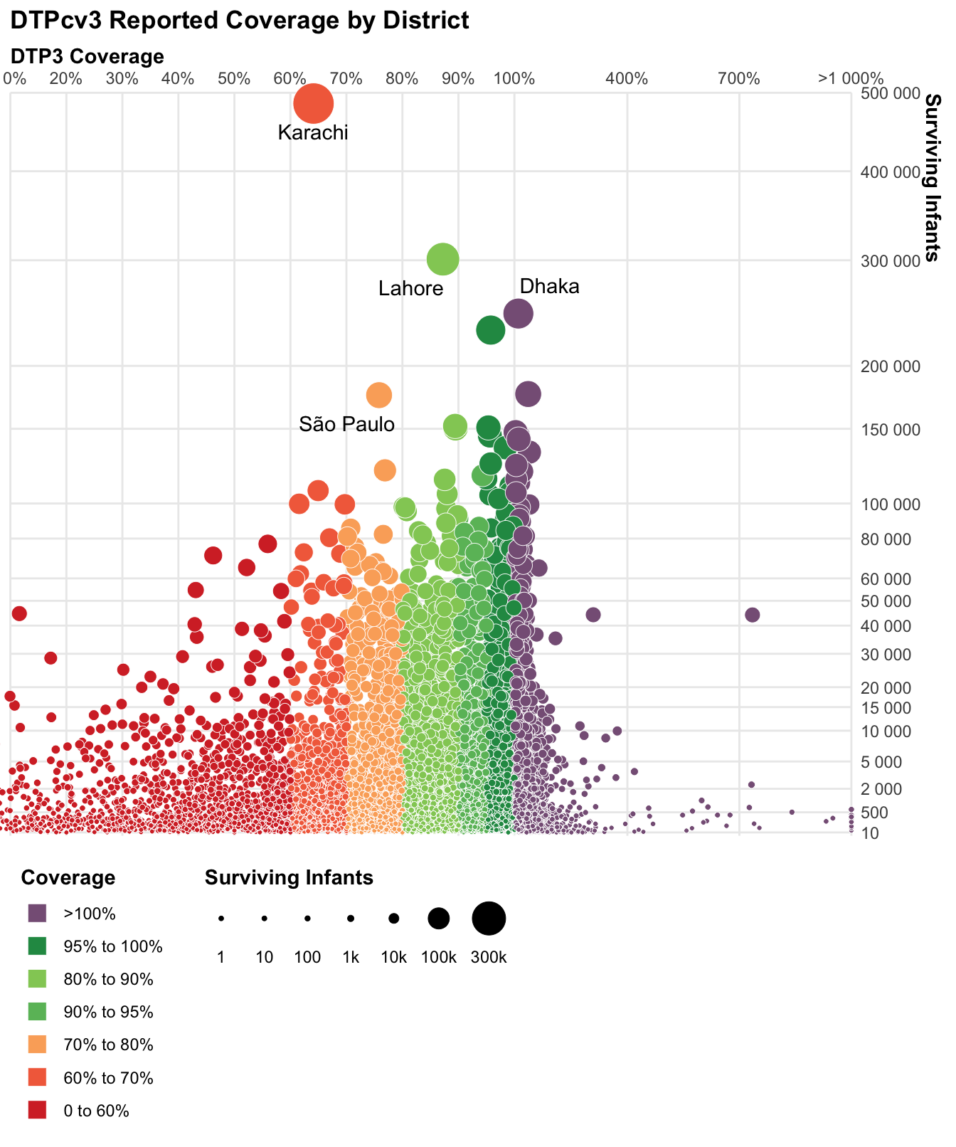
Subnational DTP3 Coverage
This visualization shows the 2016 Coverage rate and number of surviving infants at the subnational level across the world. I was struck by the aesthetics of the plot, however I am torn as to whether the redundant encoding of size and color is distracting or not. I have been taught that all redundant information should be excluded, and quite clearly each variable is encoded in two different aesthetics, however I do think the colors, at least, help to differentiate and draw the eye. Regardless, the plot was quite a challenge to replicate so I kept the redundancy just for fun.
subnational %>%
  filter(
    annum == 2016,
    Vaccode == "DTP3",
    !is.na(Admin2)
  ) %>%
  mutate(
    color = case_when(
      Coverage <= 60 ~ "0 to 60%",
      Coverage <= 70 ~ "60% to 70%",
      Coverage <= 80 ~ "70% to 80%",
      Coverage <= 90 ~ "80% to 90%",
      Coverage <= 95 ~ "90% to 95%",
      Coverage <= 100 ~ "95% to 100%",
      TRUE ~ ">100%"
    ),
    color = factor(color, levels = subnat_coverage_order, ordered = TRUE),
    Coverage = if_else(Coverage < 1000, Coverage, 1000),
    label = if_else(Admin2 %in% subnational_dtp3_labels, Admin2, "")
  ) %>%
  sample_frac() %>%
  ggplot() +
  geom_point(
    aes(
      Coverage,
      Denominator,
      size = Denominator,
      fill = color
    ),
    shape = 21,
    color = "white",
    stroke = 0.25
  ) +
  ggrepel::geom_text_repel(
    aes(
      Coverage,
      Denominator,
      label = label
    ),
    point.padding = 0.5,
    min.segment.length = 1
  ) +
  scale_x_continuous(
    trans = "x_trans",
    breaks = subnat_x_breaks,
    labels = subnat_x_labels,
    position = "top"
  ) +
  scale_y_continuous(
    trans = "sqrt",
    breaks = subnat_y_breaks,
    labels = scales::unit_format(unit = "", scale = 1, sep = ""),
    position = "right",
    limits = c(10, 500000)
  ) +
  scale_size(
    range = c(1, 10),
    breaks = subnat_size_breaks,
    labels = subnat_size_labels,
    guide = guide_legend(
      title.position = "top",
      nrow = 1,
      override.aes = list(fill = "black", color = "black"),
      label.position = "bottom",
      label.hjust = 0.5
    )
  ) +
  scale_fill_manual(
    values = colors_dtp3_subnational,
    guide = guide_legend(
      title.position = "top",
      ncol = 1,
      override.aes = list(shape = 22, size = 5),
      reverse = TRUE
    )
  ) +
  labs(
    x = "DTP3 Coverage",
    y = "Surviving Infants",
    title = "DTPcv3 Reported Coverage by District",
    fill = "Coverage",
    size = "Surviving Infants"
  ) +
  theme_minimal() +
  theme(
    axis.title.x = element_text(face = "bold", hjust = 0),
    axis.title.y = element_text(face = "bold", hjust = 0),
    legend.position = "bottom",
    legend.title = element_text(face = "bold"),
    legend.justification = "left",
    plot.title = element_text(face = "bold"),
    panel.grid.minor = element_blank()
  ) +
  coord_cartesian(
    xlim = c(10, 1000),
    ylim = c(0, 500000),
    expand = FALSE,
    clip = "off"
  )