Visualizing Course Descriptions
As my senior year at Stanford nears the end, I’ve started to think more and more about what I’ve really learned here, and what I’ll be taking away from my undergraduate experience. Sure, there’s plenty of sappy stuff about coming of age and figuring out what I want to start doing with my life (spoiler: haven’t figured it out), but what about concrete knowledge I’ve gained from my classes. Being the data nerd that I am, I decided to take a “data-driven” approach to this question, and see what I could find. Here’s the results!
library(tidyverse)
library(googlesheets)
library(rvest)
library(tidytext)
library(wordcloud)
library(tm)
library(igraph)
library(networkD3)
FILE.googlesheets <- "~/Data/course-descriptions/myclasses.Rds"
FILE.explorecourses <- "~/Data/course-descriptions/courses1819raw.Rds"Collating the data
First, we need some data! Although I played around with trying to scrape my transcript, it proved not worth the effort with all the Stanford security, so I created a Google Sheets document and manually recorded each class I have taken, including the department code e.g. “CS”, the course code e.g. “106A”, the school e.g. “School of Engineering”, the number of units I took the class for, and the quarter I took the class (recorded as an integer from 1-12).
Then I was able to use the googlesheets package to pull this data into R with only a few lines of code:
# Log in to Google
gs_auth(new_user = TRUE)

# Find the document we want
sheet_key <-
  gs_ls() %>%
  filter(sheet_title == "courses") %>%
  pull(sheet_key)

# Read the document
df <-
  gs_key(sheet_key) %>%
  gs_read()
To avoid authentication over and over, I saved the resulting dataframe, and we’ll use the saved version.
classes <- read_rds(FILE.googlesheets)
head(classes) %>% knitr::kable()| dept | code | school | units | quarter |
|---|---|---|---|---|
| esf | 6a | Office of Vice Provost for Undergraduate Education | 7 | 1 |
| lawgen | 116n | Law School | 3 | 1 |
| math | 51 | School of Humanities & Sciences | 5 | 1 |
| cs | 106a | School of engineering | 5 | 2 |
| physics | 41 | School of Humanities & Sciences | 4 | 2 |
| physics | 41a | School of Humanities & Sciences | 1 | 2 |
Let’s clean up the formatting a little first. We’ll also add a variable that contains just the numeric part of the course code, in case we want to look at how advanced the coursework is by the course number.
classes <-
  classes %>%
  mutate(
    dept = str_to_upper(dept),
    code = str_to_upper(code),
    school = str_to_title(school),
    code_numeric = parse_number(code)
  )
head(classes) %>% knitr::kable()| dept | code | school | units | quarter | code_numeric |
|---|---|---|---|---|---|
| ESF | 6A | Office Of Vice Provost For Undergraduate Education | 7 | 1 | 6 |
| LAWGEN | 116N | Law School | 3 | 1 | 116 |
| MATH | 51 | School Of Humanities & Sciences | 5 | 1 | 51 |
| CS | 106A | School Of Engineering | 5 | 2 | 106 |
| PHYSICS | 41 | School Of Humanities & Sciences | 4 | 2 | 41 |
| PHYSICS | 41A | School Of Humanities & Sciences | 1 | 2 | 41 |
Just with this data we can already do some cool analysis. For example, let’s look at the distribution of units over the course of my degree, divided by school…
total_unit_count <-
  classes %>%
  group_by(quarter) %>%
  summarise(total_units = sum(units))
## `summarise()` ungrouping output (override with `.groups` argument)

fall_quarters <-
  tribble(
    ~quarter, ~label,
    1, "2015-2016",
    4, "2016-2017",
    7, "2017-2018",
    10, "2018-2019"
  )

classes %>%
  group_by(school, quarter) %>%
  summarise(total_units = sum(units)) %>%
  ggplot(aes(quarter, total_units)) +
  geom_vline(aes(xintercept = quarter), data = fall_quarters, color = "grey90") +
  geom_point(aes(group = school, color = school)) +
  geom_line(aes(group = school, color = school)) +
  geom_line(data = total_unit_count, color = "grey80") +
  geom_text(
    aes(x = quarter + 0.2, label = label),
    y = 14,
    color = "grey40",
    angle = 90,
    data = fall_quarters,
    hjust = 0
  ) +
  theme(
    legend.position = "bottom",
    legend.direction = "vertical",
    axis.ticks.x = element_blank(),
    axis.text.x = element_blank()
  ) +
  labs(
    x = "Quarter",
    y = "Units",
    color = NULL,
    title = "Over Time I've started to take more classes in Engineering\nand fewer in Humanities and Sciences"
  )
## `summarise()` regrouping output by 'school' (override with `.groups` argument)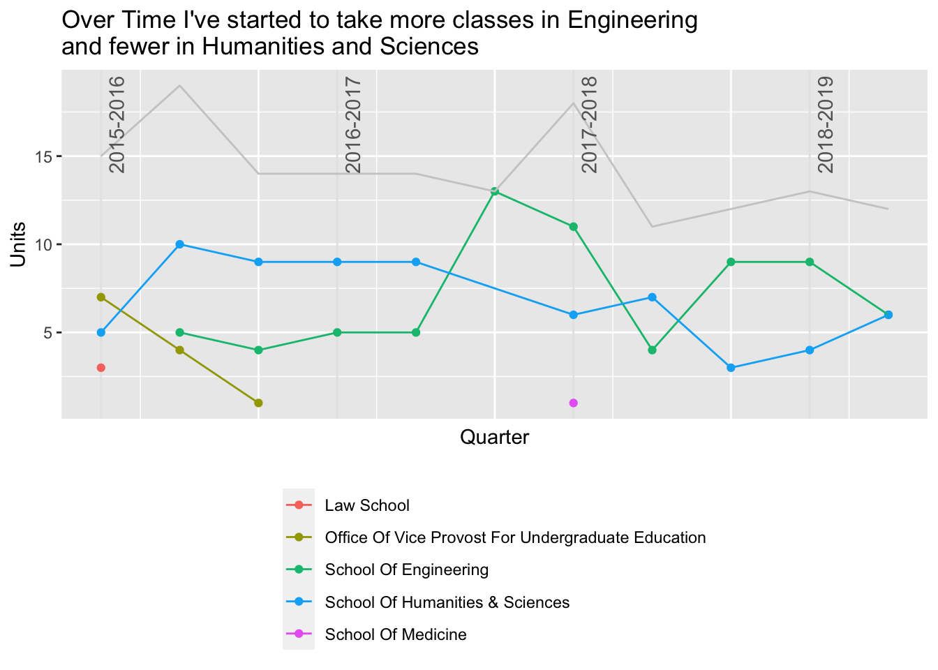
…what about by Department?
classes %>%
  group_by(school, dept) %>%
  summarise(total_units = sum(units)) %>%
  ggplot(aes(reorder(dept, total_units), total_units)) +
  geom_segment(aes(xend = dept, y = 0, yend = total_units), color = "grey60") +
  geom_point(aes(color = school), size = 3) +
  scale_y_continuous(limits = c(0, 42), expand = c(0,0)) +
  theme_minimal() +
  theme(
    legend.position = "bottom",
    legend.direction = "vertical"
  ) +
  coord_flip() +
  labs(
    x = NULL,
    y = "Total Units",
    color = NULL,
    title = "Computer Science Dominates My Unit Count",
    subtitle = "Math, MS&E and Statistics classes are also required of my major"
  )
## `summarise()` regrouping output by 'school' (override with `.groups` argument)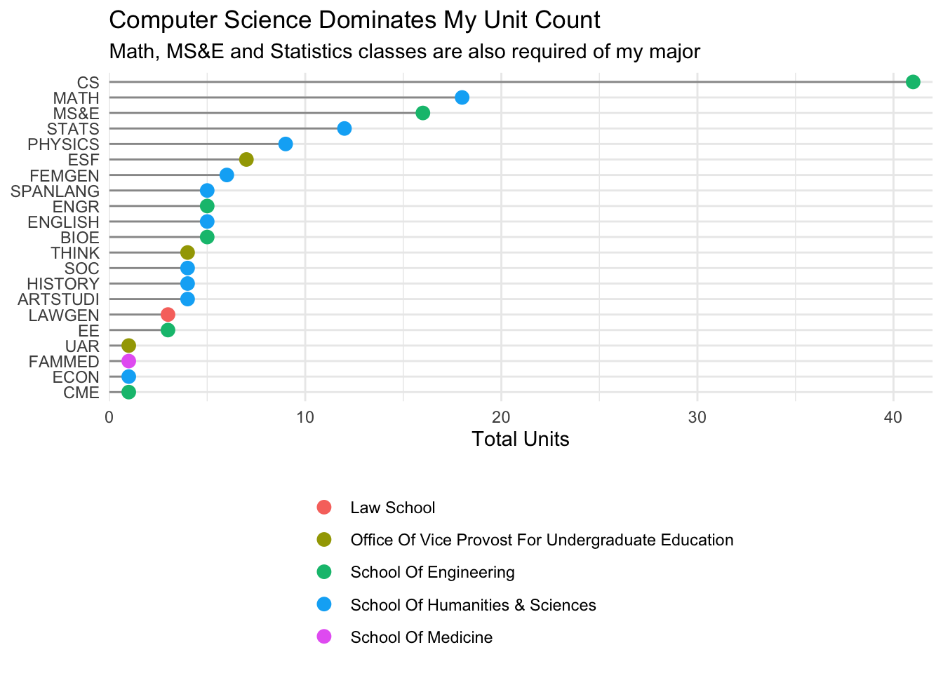
Scraping Course Descriptions
What I am really curious about, though, is whether we can see any themes in my interests from the course descriptions of the classes I’ve taken, as listed in Explore Courses. I wasn’t about to copy and paste all of these by hand, plus this was a great opportunity to practice web scraping with rvest!
I scraped ALL of the course descriptions from every page of Explore Courses, so that I can join the descriptions to my dataframe of classes. This took an hour or so to run, but I made sure to save the result!
explore_courses <- read_rds(FILE.explorecourses)
head(explore_courses)
## # A tibble: 6 x 4
##   num    title             desc                       attrs
##   <chr>  <chr>             <chr>                      <chr>
## 1 AA 47… Why Go To Space?  "Why do we spend billions… "\r\n\t\t\t\t\t\r\n\t\t\t…
## 2 AA 93: Building Trust i… "Preparatory course for B… "\r\n\t\t\t\t\t\r\n\t\t\t…
## 3 AA 10… Introduction to … "This class introduces th… "\r\n\t\t\t\t\t\r\n\t\t\t…
## 4 AA 10… Introduction to … "This course explores the… "\r\n\t\t\t\t\t\r\n\t\t\t…
## 5 AA 10… Air and Space Pr… "This course is designed … "\r\n\t\t\t\t\t\r\n\t\t\t…
## 6 AA 10… Surviving Space   "Space is dangerous. Anyt… "\r\n\t\t\t\t\t\r\n\t\t\t…
Clearly, the results are a little messy! For now, though all we want is the description to join to the datafram of my classes, and maybe the title of the classes might be fun too. To join to our dataset we need to split the num variable into department and code. While we’re at it, let’s drop any prerequisites from the desc variable. We don’t care about them for analysing the descriptions.
explore_courses <-
  explore_courses %>%
  mutate(num = str_extract(num, "^[^:]*")) %>%
  separate(num, into = c("dept", "code"), sep = " ", extra = "merge") %>%
  mutate(dept = str_to_upper(dept), code = str_to_upper(code)) %>%
  separate(
    desc,
    into = c("desc"),
    sep = "(Prerequisites:|Prerequisite:|prerequisite:|prerequisites:)",
    extra = "drop"
  ) %>%
  select(dept, code, title, desc)

head(explore_courses, 2) %>% knitr::kable()| dept | code | title | desc |
|---|---|---|---|
| AA | 47SI | Why Go To Space? | Why do we spend billions of dollars exploring space? What can modern policymakers, entrepreneurs, and industrialists do to help us achieve our goals beyond planet Earth? Whether it is the object of exploration, science, civilization, or conquest, few domains have captured the imagination of a species like space. This course is an introduction to space policy issues, with an emphasis on the modern United States. We will present a historical overview of space programs from all around the world, and then spend the last five weeks discussing present policy issues, through lectures and guest speakers from NASA, the Department of Defense, new and legacy space industry companies, and more. Students will present on one issue that piques their interest, selecting from various domains including commercial concerns, military questions, and geopolitical considerations. |
| AA | 93 | Building Trust in Autonomy | Preparatory course for Bing Overseas Studies summer course in Edinburgh. |
That looks better!!
Now we can join this to classes:
classes_with_descriptions <-
  classes %>%
  left_join(explore_courses, by = c("dept", "code"))
Even in the first few results, there are some NA values resulting from the join. A concern is that the matching of dept and code isn’t working due to a formatting quirk. Sadly, it’s even worse… Explore Courses deletes classes after they haven’t been offered for a while!
classes_with_descriptions %>%
  filter(is.na(desc)) %>%
knitr::kable()| dept | code | school | units | quarter | code_numeric | title | desc |
|---|---|---|---|---|---|---|---|
| LAWGEN | 116N | Law School | 3 | 1 | 116 | NA | NA |
| PHYSICS | 41A | School Of Humanities & Sciences | 1 | 2 | 41 | NA | NA |
| THINK | 52 | Office Of Vice Provost For Undergraduate Education | 4 | 2 | 52 | NA | NA |
| CS | 41 | School Of Engineering | 2 | 6 | 41 | NA | NA |
| CS | 193X | School Of Engineering | 3 | 6 | 193 | NA | NA |
| ECON | 5 | School Of Humanities & Sciences | 1 | 11 | 5 | NA | NA |
Most of these are classes I took a while ago, and most are for few units, so excluding these from analysis of descriptions shouldn’t be a big deal!
Analysing Course Descriptions
Now we get to the fun part! The code in this section is adapted from this awesome blog post by Juan Orduz analyzing tweet data.
Let’s start with something easy and classic, a wordcloud! For this we can use the packages tidytext to help with counting words, and wordcloud for visualization.
classes_with_descriptions %>%
  unnest_tokens(word, desc) %>%
  anti_join(get_stopwords()) %>%
  mutate(word = str_extract(word, "[:alpha:]+")) %>%
  count(word) %>%
  arrange(desc(n)) %>%
  with(
    wordcloud(
      word,
      n,
      min.freq = 5,
      random.order = FALSE,
      colors = brewer.pal(8, 'Dark2')
    )
  )
## Joining, by = "word"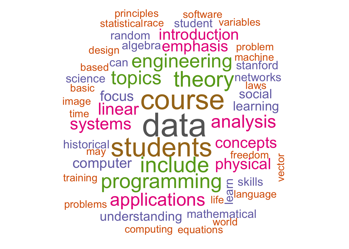
No surprises here! But it’s still fun to see my degree described in pretty colored words.
What is perhaps most interesting to me is whether we can see relationships between topics in the course descriptions! For this, I used the igraph package to create a graph, and the networkD3 package for visualization with D3.
First we use tidytext to count the bigrams, the pairs of words that occur next to each other, in the descriptions.
word_bigrams <-
  classes_with_descriptions %>%
  unnest_tokens(
    input = desc,
    output = bigram,
    token = 'ngrams',
    n = 2
  ) %>%
  filter(!is.na(bigram)) %>%
  separate(col = bigram, into = c('word1', 'word2'), sep = ' ') %>%
  select(word1, word2)

bigram_count <- word_bigrams %>% count(word1, word2, sort = TRUE)
Now we can create a graph object and use the base R (gasp) plot function to visualize the relationships between words. We use a threshold to include only bigrams that occur more times than the threshold. It turns out that 2 is a good threshold for this dataset.
threshold <- 2
network <-
  bigram_count %>%
  filter(n > threshold) %>%
  graph_from_data_frame(directed = FALSE)

plot(
  network,
  vertex.size = 1,
  vertex.label.color = 'black',
  vertex.label.cex = 0.7,
  vertex.label.dist = 1,
  edge.color = 'gray',
  main = 'Course Descriptions',
  alpha = 50
)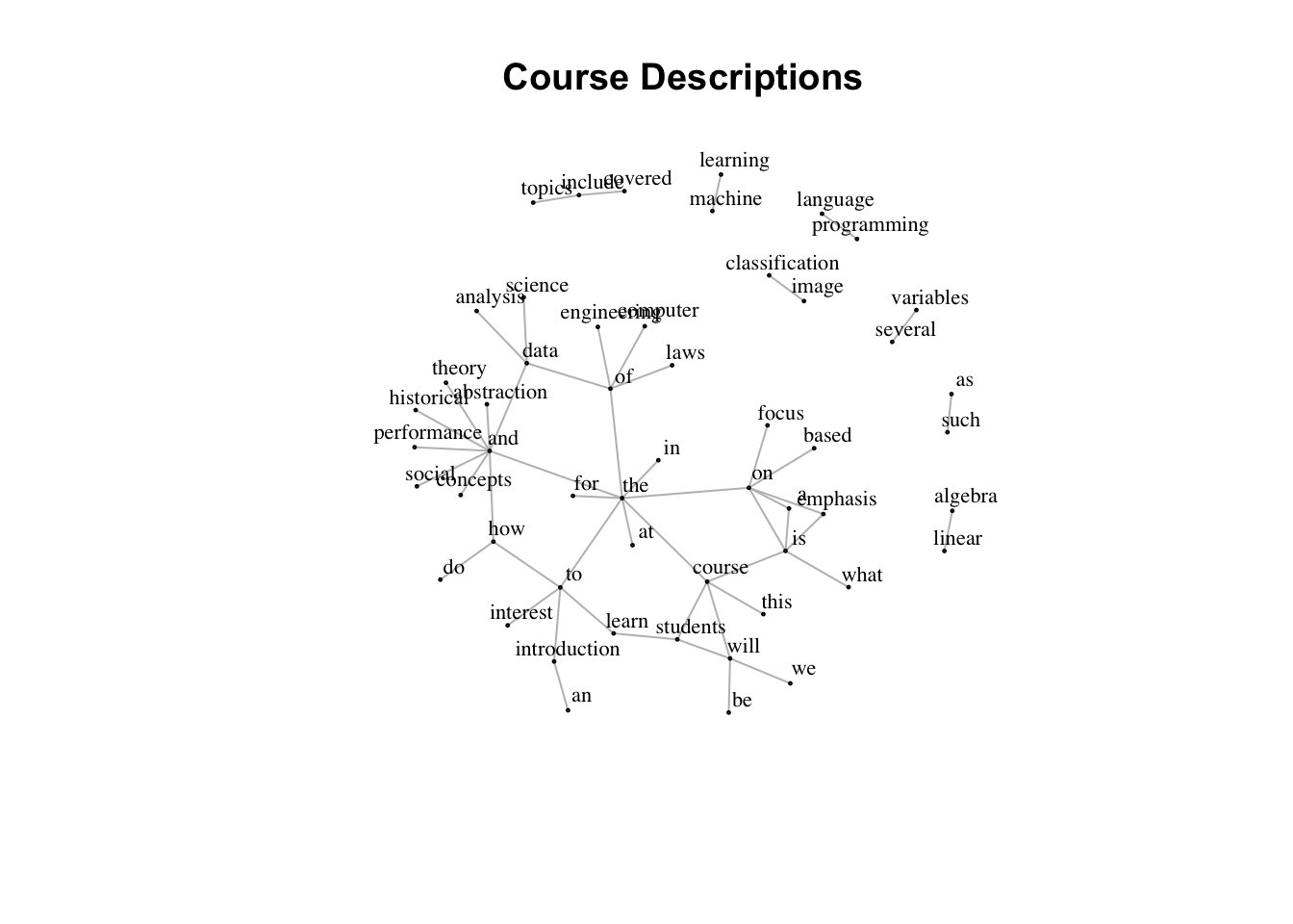
Even restricting the graph to bigrams that occur at least 3 times, it’s still hard to really see the relationships here. Now’s when we use D3 to take this visualization to the next level. Since there’s so much more interaction possible with a D3 graph, we’ll lower the threshold to see a little more detail.
threshold <- 1
network <-
  bigram_count %>%
  filter(n > threshold) %>%
  graph_from_data_frame(directed = FALSE)

network_D3 <- igraph_to_networkD3(network)
network_D3$nodes <-
  network_D3$nodes %>%
  mutate(
    degree = 10 * degree(network),
    group = 1
  )
network_D3$links <-
  network_D3$links %>%
  mutate(width = 10 *  E(network)$n / max(E(network)$n))

forceNetwork(
  Links = network_D3$links,
  Nodes = network_D3$nodes,
  Source = 'source',
  Target = 'target',
  NodeID = 'name',
  Group = 'group',
  opacity = 0.9,
  Value = 'width',
  Nodesize = 'degree',
  linkWidth = JS("function(d) { return Math.sqrt(d.value); }"),
  fontSize = 12,
  zoom = TRUE,
  opacityNoHover = 1
)
It’s so much fun to play around with the D3 graph visualization. Hover over nodes to read the labels more clearly. Unsurprisingly, the words cluster around the three nodes: “and”, “the” and “of”, which makes it more difficult to see relationships between domain terms. It’s fun to look at the bigrams that aren’t part of the main connected component, like “machine learning”, “maxwell’s differential equations”, “health care” and “neural networks”. Again, not surprising but kind of cute.