#SWDChallenge March 2019
This month I decided to take part in the Storytelling With Data monthly challenge for the first time! The dataset we were given to explore contains global aid exchanges between 47 countries across the world across the years 1973-2013. The goal is to create visualizations that answers the broad question: Who Donates?, as well as some bonus questions about distribution of donations geographically, temporally and by purpose of donation. Here’s my initial attempt! Along with some code. (The only package I use here is tidyverse).
The Data
The data provided is nice and clean, so all we are left to do is read it in using read_csv(). I changed some variable names to make it nicer to work with, and noticed that there are a few negative quantities of money in the data, which I drop since they are impossible. Here’s a glimpse of what the data looks like:
| id | year | donor | recipient | amount | purpose_code | purpose_desc |
|---|---|---|---|---|---|---|
| 2414478 | 1977 | Saudi Arabia | India | 348718518 | 23030 | Power generation/renewable sources |
| 2414509 | 1977 | Saudi Arabia | Brazil | 191647004 | 23040 | Electrical transmission/ distribution |
| 2414635 | 1983 | Saudi Arabia | India | 79371799 | 21030 | Rail transport |
| 2414665 | 1984 | Saudi Arabia | Taiwan | 212202942 | 21030 | Rail transport |
| 2414667 | 1984 | Saudi Arabia | Korea | 134511154 | 21040 | Water transport |
| 2414684 | 1985 | Saudi Arabia | India | 128074768 | 23000 | Energy generation and supply, combinations of activities |
Who Donates?
One of the challenges in answering this question is how to summarize across time. I chose to look at the proportion of the total money contributed to global aid that each country contributed and received.
donated <-
  data %>%
  group_by(donor) %>%
  summarise(donated = sum(amount)) %>%
  mutate(prop_donated = donated / sum(donated)) %>%
  select(country = donor, prop_donated)
## `summarise()` ungrouping output (override with `.groups` argument)received <-
data %>%
group_by(recipient) %>%
summarise(received = sum(amount)) %>%
mutate(prop_received = received / sum(received)) %>%
select(country = recipient, prop_received)## `summarise()` ungrouping output (override with `.groups` argument)aid <-
donated %>%
full_join(received, by = c("country")) %>%
mutate_at(vars(-country), ~if_else(is.na(.), 0, .)) %>%
gather(-country, key = direction, value = proportion_of_aid) %>%
mutate(direction = str_extract(direction, "[^_]+$"))
country_order <-
aid %>%
spread(direction, proportion_of_aid) %>%
mutate(diff = donated - received) %>%
arrange(diff) %>%
pull(country)
aid <-
aid %>%
mutate(country = factor(country, levels = country_order, ordered = TRUE))
segments <-
aid %>%
spread(direction, proportion_of_aid)
aid %>%
ggplot(aes(y = country)) +
geom_segment(
aes(yend = country, x = donated, xend = received),
color = "grey40",
data = segments
) +
geom_point(aes(x = proportion_of_aid, color = direction), size = 2) +
scale_y_discrete(expand = expand_scale(0)) +
scale_x_sqrt(
labels = scales::percent,
expand = expand_scale(0),
limits = c(0,0.4),
breaks = c(0, 0.01, 0.025, 0.05, 0.1, 0.2, 0.3, 0.4)
) +
scale_color_brewer(type = "qual", palette = "Set1", labels = str_to_title) +
theme_minimal() +
theme(legend.position = "top") +
coord_cartesian(clip = "off") +
labs(
y = NULL,
x = glue::glue("Percentage of Total Aid {min(pull(data, year))} - {max(pull(data, year))}"),
color = NULL,
title = "The United States and Japan are the world's major donors",
subtitle = "India has received almost 40% of all global aid"
)## Warning: `expand_scale()` is deprecated; use `expansion()` instead.
## Warning: `expand_scale()` is deprecated; use `expansion()` instead.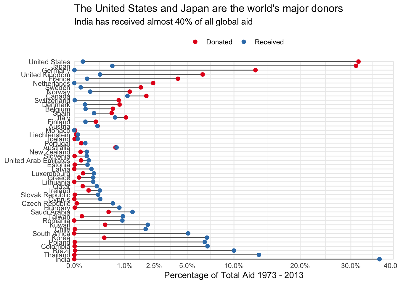
Excuse the squished y-axis. I played around with it for a while and eventually gave up. Any hints are very welcome!
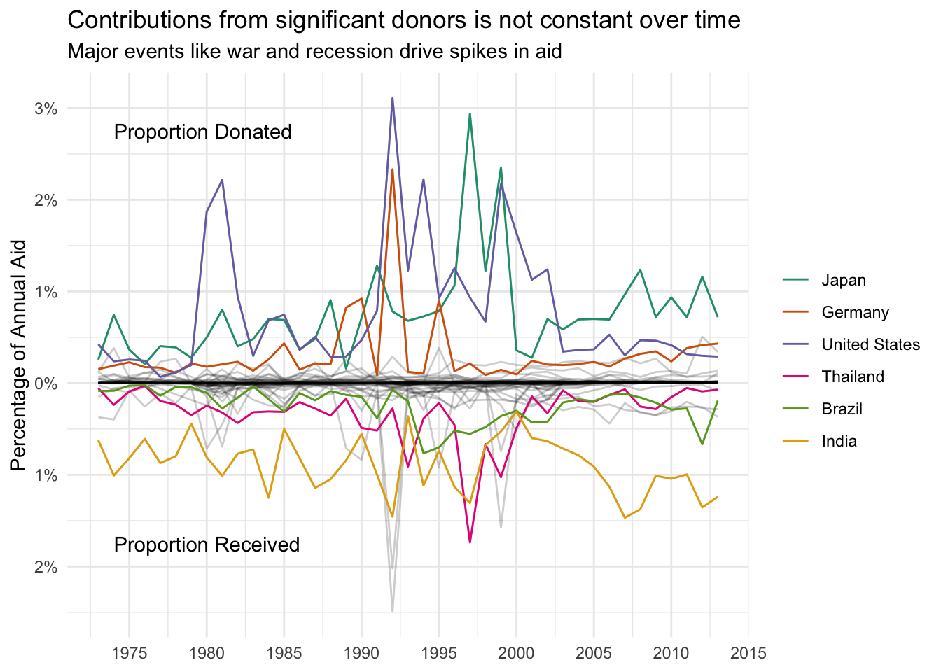
Has the Amount Donated Changed Over Time?
In keeping with the same metric, proportion of aid contributed and received, we can also look at the trends over time. I’ve highlighted the top three donors and recipients in the figure. Interestingly, it seems that receiving tends to be steadier over time, while donations see more anomalous spikes
donated <-
  data %>%
  group_by(donor, year) %>%
  summarise(donated = sum(amount)) %>%
  ungroup() %>%
  mutate(prop_donated = donated / sum(donated)) %>%
  select(country = donor, year, prop_donated)
## `summarise()` regrouping output by 'donor' (override with `.groups` argument)received <-
data %>%
group_by(recipient, year) %>%
summarise(received = sum(amount)) %>%
ungroup() %>%
mutate(prop_received = received / sum(received)) %>%
select(country = recipient, year, prop_received)## `summarise()` regrouping output by 'recipient' (override with `.groups` argument)timeseries <-
donated %>%
full_join(received, by = c("country", "year")) %>%
mutate_at(vars(prop_donated, prop_received), ~if_else(is.na(.), 0, .)) %>%
gather(prop_donated, prop_received, key = direction, value = proportion) %>%
mutate(
proportion = if_else(direction == "prop_donated", proportion, -proportion)
)
top_3 <-
aid %>%
filter(direction == "donated") %>%
top_n(3, proportion_of_aid) %>%
pull(country)
bottom_3 <-
aid %>%
filter(direction == "received") %>%
top_n(3, proportion_of_aid) %>%
pull(country)
timeseries_main <-
timeseries %>%
filter(country %in% top_3 & direction == "prop_donated" |
country %in% bottom_3 & direction == "prop_received")
country_order <-
timeseries_main %>%
filter(year == max(pull(data, year))) %>%
arrange(desc(proportion)) %>%
pull(country)
timeseries_main <-
timeseries_main %>%
mutate(country = factor(country, levels = country_order, ordered = TRUE))
labeller <-
function(y) {
y = if_else(y < 0, -y, y)
scales::percent(y)
}
timeseries %>%
unite(group, country, direction, remove = FALSE) %>%
ggplot(aes(year, proportion)) +
geom_line(aes(group = group), alpha = 0.2) +
geom_line(aes(color = country), data = timeseries_main) +
scale_x_continuous(breaks = seq(1970, 2015, by = 5)) +
scale_y_continuous(labels = labeller) +
scale_color_brewer(type = "qual", palette = "Dark2") +
theme_minimal() +
labs(
x = NULL,
color = NULL,
y = glue::glue("Percentage of Annual Aid"),
title = "Contributions from significant donors is not constant over time",
subtitle = "Major events like war and recession drive spikes in aid"
) +
annotate(
geom = "text",
x = 1974,
y = 0.0275,
label = "Proportion Donated",
hjust = 0
) +
annotate(
geom = "text",
x = 1974,
y = -0.0175,
label = "Proportion Received",
hjust = 0
)